The Architecture of Home: Why Cyrillic is Our First Digital Infrastructure
On May 24th, Bulgaria celebrates its alphabet as a symbol of history and culture. But the more I work in web design, the more I realize something else: our alphabet is also infrastructure.
It shapes how we read, how we navigate, and how we perceive a brand online. It dictates the rhythm of a page, the balance of a menu, and the visual “voice” of a business long before a visitor reads the first sentence.
At Art Spot Web Studio, we often discuss “invisible infrastructure”—security, performance, and structure. But there is another layer, older than code and deeply tied to identity: the script. For us, that is Cyrillic.
For a Bulgarian designer, Cyrillic isn’t just a language toggle. It is how Bulgaria shows up on the screen.
The Language Behind the Design
The modern web was largely built around Latin script. Most templates and typography systems were created with English in mind—shorter words, a specific visual weight, and a different rhythmic pace.
Bulgarian text requires something else.
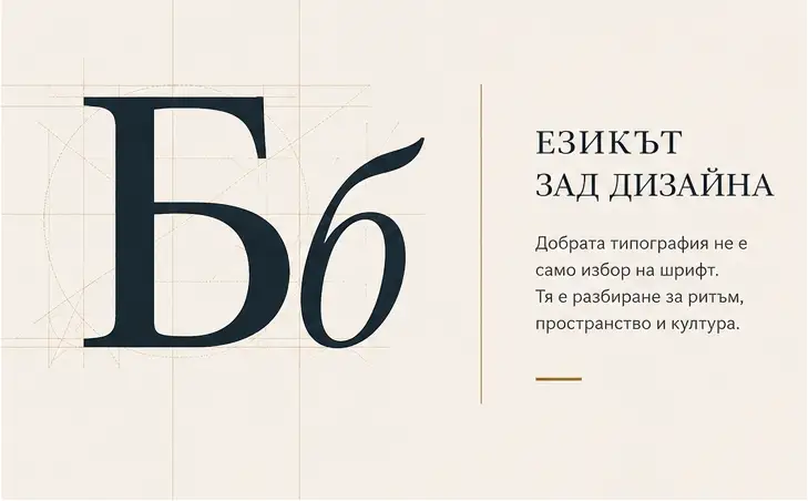
It needs more breathing room. It needs a structure that can expand naturally without looking crowded or “broken.” Most importantly, it needs fonts that don’t just “support” Cyrillic characters but are designed with respect for their unique forms.
This is the difference between a website that is merely translated into Bulgarian and one that truly feels at home in Bulgarian.
When the Layout Loses Its Balance
Many layouts that look clean in English begin to feel “off” after translation. Menus become overloaded. Headlines lose their rhythm. Buttons feel cramped. The typography starts to look mechanical.
These aren’t just minor aesthetic details. They affect the sense of trust and professionalism a brand conveys. When a site isn’t designed with the Bulgarian language in mind, the user can sense it. When it is designed for the language from day one, the result is more natural, calm, and confident.
What Cyrillic Needs
Good design doesn’t force a language to behave like English. It adapts to how the language actually works.
Bulgarian words are often longer, and our sentences carry a different visual density. This changes the entire composition of the page. Typography is the key here. Some fonts technically include Cyrillic characters, but they look like “extended Latin”—stiff and unnatural. Others are designed with an understanding of Bulgarian forms (like the softer, more handwritten nature of the letters “б” and “в”). When you use the right typeface, the text feels alive and human.
The “Invisible” Stress-Test
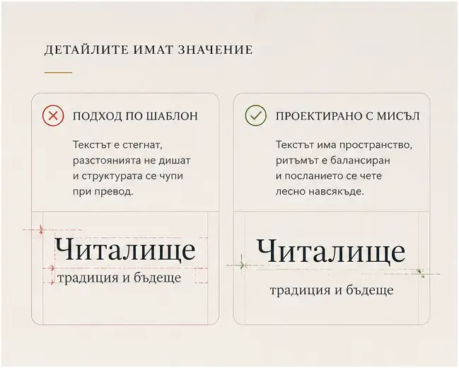
One of the most overlooked parts of web design is how text behaves across devices.
A headline might look great on a 32-inch monitor but lose its balance on a phone. A navigation bar might work in English but wrap awkwardly in Bulgarian on a laptop screen. This is why a good Bulgarian site isn’t “translated” at the end—it is tested, rearranged, and built for the language from the start.
Returning Home
After years of designing for markets in the US and Australia, I began to see how often “global standards” are assumed to be universal.
But universal design hardly exists.
Every language carries its own rhythm and culture. Returning to work focused on the Bulgarian market made this even clearer. Bulgaria deserves more than templates just “filled in” with Cyrillic. It deserves digital spaces built around the way the language actually looks and sounds.
For me, this became a personal mission: taking international experience and applying it in a way that truly belongs here.
Lessons from the Chitalishte
This idea was solidified during our project supporting Bulgarian chitalishta (community cultural centers). A chitalishte is more than an institution; it is a holder of memory and community. Its website should reflect that.
It doesn’t need “aggressive modernity” or a “corporate” feel. It needs clarity, dignity, and warmth. Here, design stops being decoration and becomes care—care for the people, the access to information, and the feeling that this digital space belongs to its community.

Digital Identity as a Competitive Edge
For a small business, local identity isn’t a limitation—it’s an advantage. In a world of identical templates, design that understands the local language and culture feels more authentic and memorable.
Cyrillic is more than just a script. It is the structure holding Bulgarian digital identity together. When we design with attention to its nuances, we aren’t just making “prettier” websites; we are creating spaces where the Bulgarian language can live naturally and confidently online.
This May 24th, take a moment to look through your screens with a different perspective.